WordPress Website Redesign Example for Small Business

Behind the scenes of our digital marketing website redesign
As a website design agency, we help small businesses in Baltimore and across the USA transform their online presence. We’ll happily spend all day creating head-turning, revenue-generating websites for them, but our own website? That stayed on the bottom of our to-do list for a long time.
When we finally got the chance to work our magic on our own website, it was a game-changer.
In this post, we’re leading by example. You’ll get the inside scoop on how we redesigned our WordPress website to help us reach our marketing goals and get more inquiries from the right prospects.
WordPress Website Redesign Example for Small Business
The Before
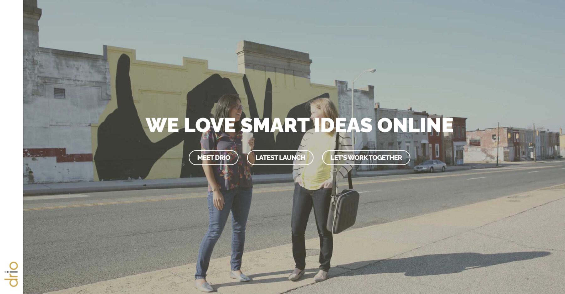
Our old website did the job. We had an About page that showed who we were, a simple service page that provided an overview of what we offer, a blog that hosted our educational content, and a way for prospects to get in touch.
But there were big questions left unanswered:
- Who do you work with?
- What are the transformations you provide?
- How are you different?
- What’s your process?
- How do I get started?
Limited service information
Sure, there was a list of digital marketing tactics we help with, but we didn’t have dedicated pages for our two core offerings: Website Design and Digital Marketing Strategy.
Behind the scenes, we had rock-solid processes and positioning for these services, but no way for prospects to read up on them. This meant we had to rely heavily on discovery calls to explain and sell them to leads.
Lack of homepage direction
Our homepage didn’t guide visitors on where to go next and was more of a blank “welcome” sign. This is a common issue we see on our clients’ websites where the homepage is treated like a box to check, rather than a strategic entry point.
The old homepage also didn’t make it super clear what we do and who we do it for, which can lead to increased bounce rates.
Minimal branding
The branding was pretty basic and didn’t capture our personable approach to marketing. We did have some information about our left-brain-right-brain approach, but it was all on the About page (not front and center). That meant visitors didn’t have much to help determine what made us different and right for them.
The color palette was clean and simple, which can absolutely work for certain businesses, but it didn’t channel who Drio is as a brand.
The After
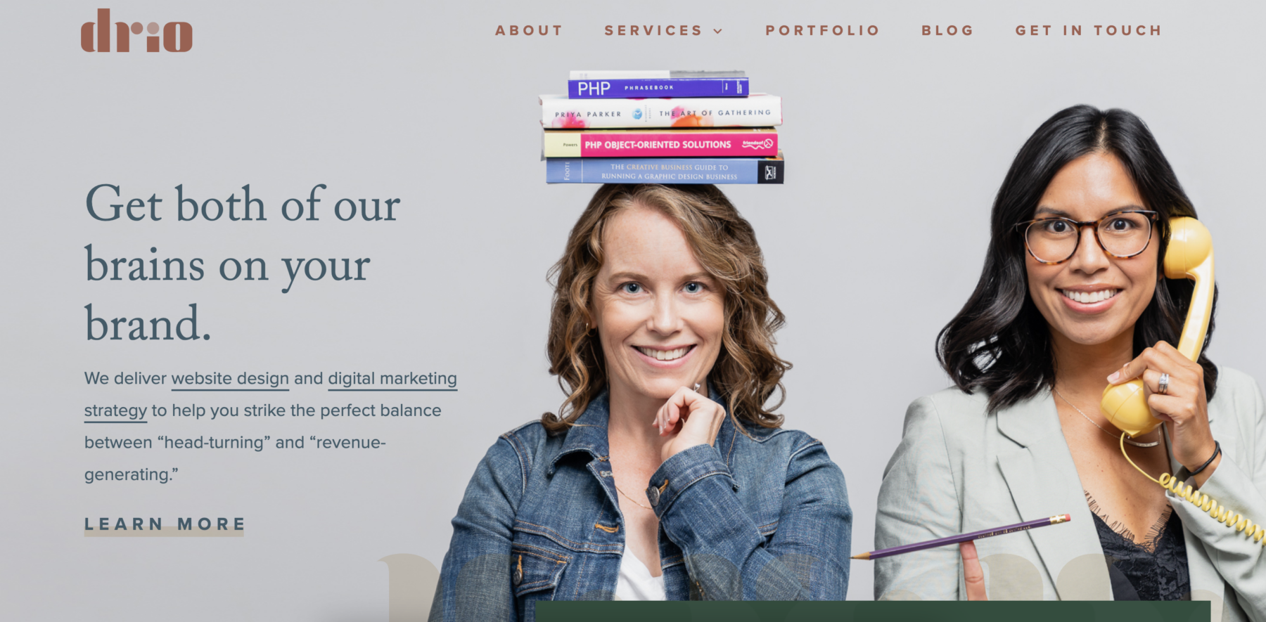
Using our favorite platform, WordPress, our new website leverages all the strategies we bring to client projects. We designed every nook and cranny to look, feel, and read in a way that channels what we’re all about and resonates with our ideal clients. It’s designed to build trust, stand out, and turn visitors into excited leads.
Solid Brand Messaging
Long before we embarked on our website redesign, we got crystal clear on what makes us tick and why our clients choose us. We clarified our mission, vision, brand values, and unique selling points. We also worked with copywriter Erika Holmes to craft a detailed brand messaging guide, which we leverage in all our marketing.
The big idea? We put our collective left-and-right-brain power together to help you strike the perfect balance between “head-turning” and “revenue-generating.”
Getting clarity on our brand messaging was an essential step before we could think about touching our redesign. Now, it’s crystal clear what we’re all about when a visitor lands on our website.

Strategic Brand Visuals
We wanted our website to be a true representation of who we are and who we help (service-based businesses, purpose-driven organizations, and woman-owned businesses). To do so, we went for a color palette that’s inviting, a little feminine, and fun but professional.
We wanted it to say “We’re not a stuffy corporate agency for the big guys, but we’re also not a super hipster firm run by recent college grads.” No shade to those agencies—it’s just not us.
The rust color captures our warmth and personable approach while the green accents reflect the growth our clients experience when they give their digital presence some love.
We combined this palette with refreshed logos and icons that are modern, simple, and memorable. The variations that feature two circles and two “Ds” symbolize our dynamic left brain-right brain Drio Duo approach.

Personality-Packed Photography
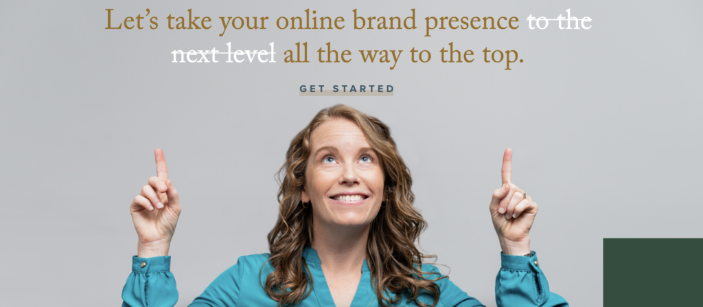
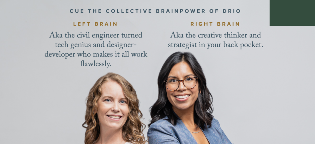
We take pride in our small but mighty team! That’s why it was essential for both our faces to be prominent on the website and to truly capture who we are as people. Because, as a client, you’ll be working closely with us!
Our goal was to help visitors feel like they already know us by exploring our website. That way, by the time we talk, they feel more comfortable.
We hired Photos by Birch to shoot fresh photography for the website which truly brought everything to life.
Intentional User Journey
Next, we mapped out a path we wanted to guide visitors on. This ensures visitors aren’t left hanging when they land on our website.
We designed the website to:
- Show visitors who we are and who we’re a perfect fit for
- Give them the details on how we can help, and pre-sell them on our services
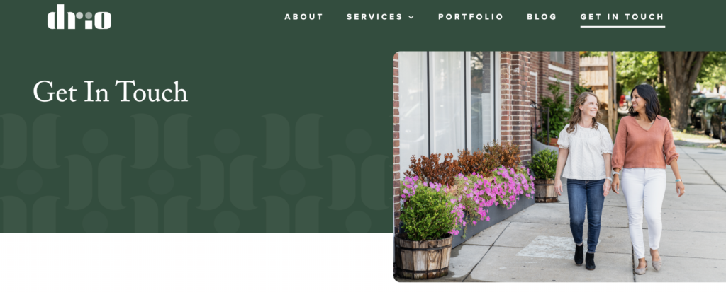
- Make it easy to reach out with a warm, personable Contact page
Crystal clear navigation, buttons, and copy help visitors to navigate the site, reducing friction and bounce rates. We’ve also implemented web accessibility principles so all visitors can easily navigate our website.
Home Page
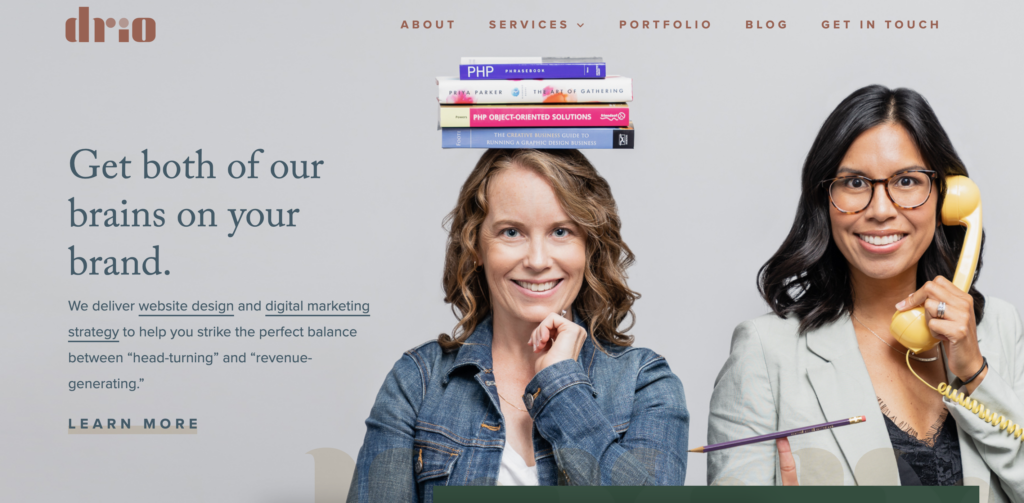
Every element on our homepage was designed to boost conversions and guide visitors on the right path.
Before prospects even have to scroll, they can see what we offer and how it benefits them, all while getting a taste of our personality thanks to the design and photography.
As users explore the Home page, they get more details on how we can help and see the transformations we provide for clients in the form of testimonials and portfolio snippets. All of these elements help move prospects closer to “Yes, I want to work with them!”
About Page
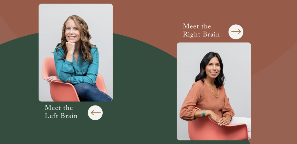
On the About page, we created interactive features that prompt users to really get to know us. Users can click to learn more about the Left Brain or Right Brain. This is a sneaky micro-conversion that helps keep users invested in their experience with our website.
We also used the About page to highlight who is a perfect fit for us and to shout out our mission: Support more women creatives.
Service Pages
Instead of trying to list every single marketing tactic we can help with, we honed in on our two big packages: Website Design and Digital Marketing Strategy. These are our bread and butter at Drio because they’re the essential building blocks for any business that wants to stand out online.
We designed persuasive service pages to showcase the benefits of these services, clarify how they work, and answer common questions before visitors reach out (including budget).
This means, by the time a lead jumps on a discovery call with us, they’ve prequalified us as a good fit for their needs.
Contact Page
Contact pages are powerful little buggers that are often overlooked. This is the moment when your prospects are making the first contact. So it’s got to count.
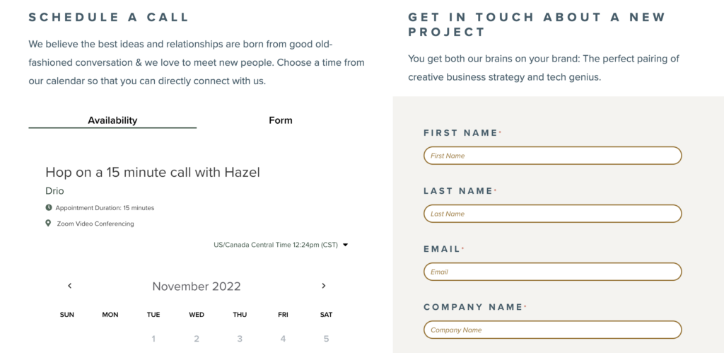
We integrated a “Schedule a call” feature because we believe the best ideas and relationships are born from good old-fashioned conversation. The same rings true for many of our ideal clients.
That said, not everyone wants to jump on a call straight away and that’s a-okay! So we also provided a user-friendly contact form for people to use if they prefer.
It’s all about making a stellar first impression.
Portfolio
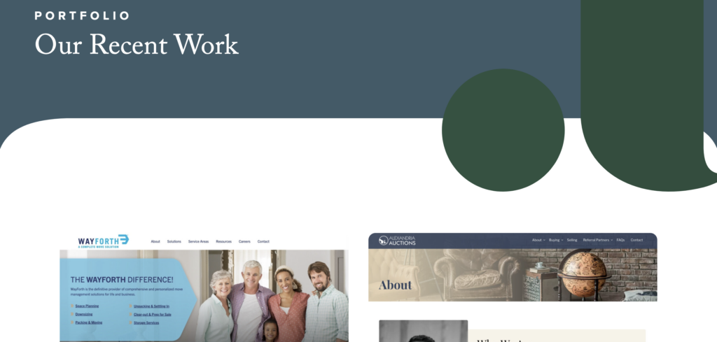
As creative service providers, a solid portfolio page is non-negotiable. We revamped ours so it’s easy to navigate and showcases our most relevant projects. This way, ideal clients see themselves in our work, making it easy for them to imagine hiring us to create similar transformations for their businesses.
Blog
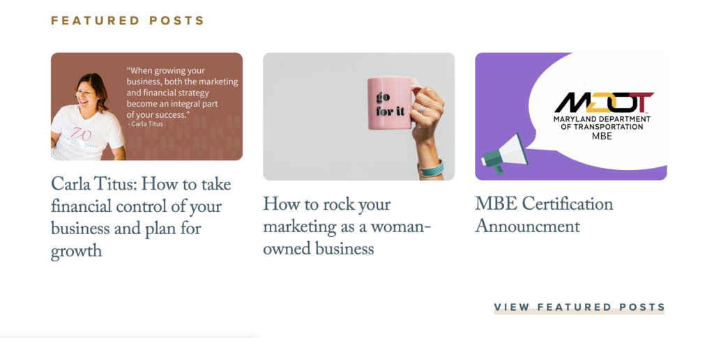
Our website redesign was the perfect opportunity to clean up our blog. We transferred over all the posts that are still valuable to our audience while clearing out the irrelevant older ones.
This gave us the chance to take stock of our content, refresh it, and organize it so visitors can find the resources they need.
Final thoughts on our website redesign
Our website redesign gave us the chance to walk in our clients’ shoes. We’ve come out of it more confident sending prospects to our digital home and fired up to go after our goals. It streamlines lead generation and connects with our dreamiest clients so we can work smarter, instead of harder.
We can’t wait to see what’s in store with our fresh digital home out in the wild. Rest assured, we’ll keep you updated.
Subscribe to our newsletter for more website redesign tips
Each month, we share a combination of small business advice, marketing tips, and website expertise. Subscribe to our newsletter for all the goodies!
