What to put on your homepage as a service-based business: 9 elements to boost conversion

Once upon a time, your homepage was basically a place to dump anything and everything and then hope visitors found what they needed next. Unfortunately, there are many service-based business websites out there still using this approach.
But your homepage can do much more for your lead generation. After all, it is often the very first page prospects land on. It sets the tone for their experience with your brand.
When we strip your homepage down to a more strategic design, you can use this page to actually guide visitors where you want them to go.
So what exactly do you need to put on your homepage to improve conversions and spark a connection with your ideal customers? We’ll show you by walking you through the website of our past client, Karen J. Seymour Digital Marketing (KJS for short).
If you run a service-based business, these 9 elements to boost conversions will be super relevant to you.
First, let’s talk about “Above the fold”
“Above the fold” is an old newspaper term that refers to the headlines visible on a folded newspaper. These days, it’s often used to refer to the space on a website a visitor sees before they have to scroll. It’s also referred to as the “Hero section” of your website.
This little space needs to pack a big bunch. Research shows you only have 10-20 seconds to convince visitors to stay on your website, and most of that decision-making happens above the fold.
When a visitor lands on your website, they need to know:
- Exactly what you do and how you help them
- That you’re a reputable business
- What to do next
No pressure. Don’t worry, we’ll show you how.
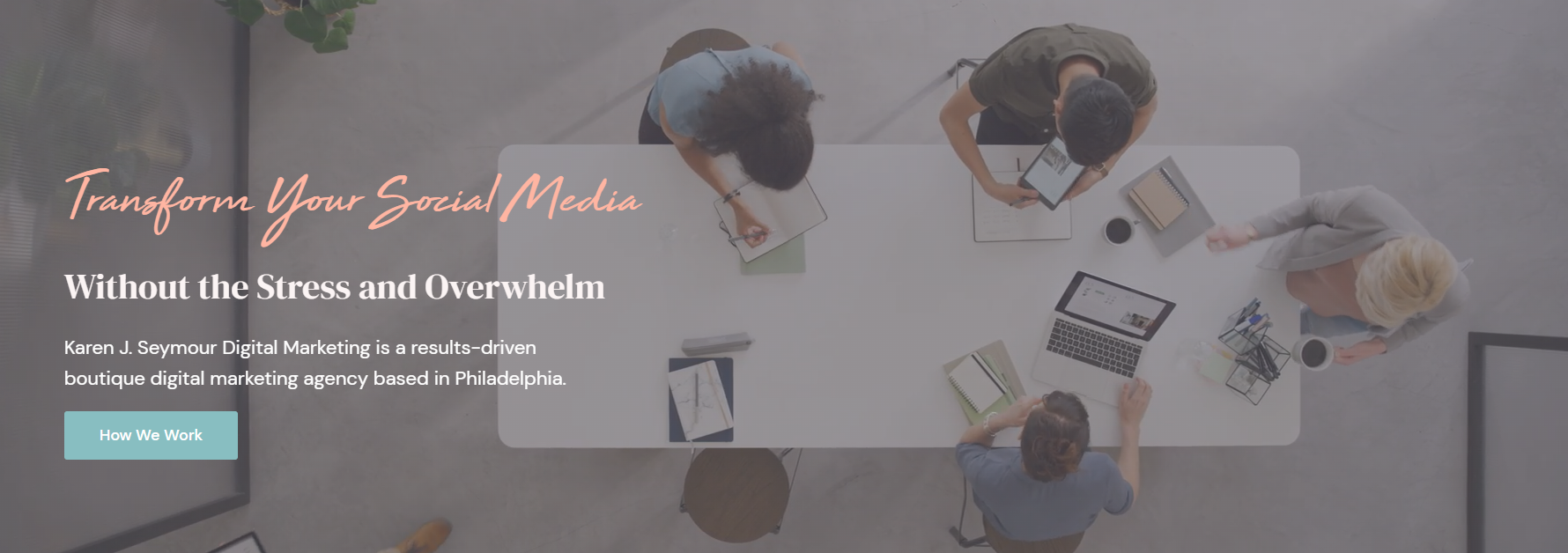
1. The Hero Section Image
The visual in your hero section is so important. It has to spark intrigue, help clarify what you do, and inspire trust (by looking great). All without interfering with the corresponding copywriting.
For KJS, we went with a moving visual. The goal of this visual was to capture the collaborative, creative nature of their approach—without looking busy or distracting.
We’re going for immersive, not irritating.
Immediately, it gives you a sense of what happens when KJS takes a project into their hands. You can see you’ll get multiple minds on your project but, at the same time, it feels intimate. This isn’t a massive corporate agency we’re talking about. It’s a tight-knit team of energetic, creative, analytical people.
Even the bicycle on the right side adds to the atmosphere. It alludes to the fact that this team is active and they value work-life balance, which is something that resonates with their ideal clients.
Not bad for a 5-second loop, hey?

2. The Headline
Meanwhile, the copywriting in your hero section also has to do some heavy lifting, which is why we highly recommend investing in a professional copywriter.
KJS’s headline tells you exactly what their digital marketing agency offers. But what’s great about it is they’ve gone a level deeper than simply stating the services they offer. They hit on the big-picture, emotional benefit of their services.
They’re saying that, yes, they improve your social media marketing. But they also help you avoid the stress and overwhelm that comes with doing it yourself—which is something all business owners resonate with.
Perfection!
We’ve used design to amplify the headline even further. As you can see, we’ve broken up “Transform your social media” and “Without the stress and overwhelm” with two different typefaces. This helps emphasize the two key benefits of their offers: business-building marketing, plus relief from unnecessary stress.
3. Hero Section Subhead
Next, there is the sub-heading: Karen J. Seymour Digital Marketing is a results-driven boutique digital marketing agency based in Philadelphia.
The subhead ensures there’s no mistaking what kind of business KJS is. The use of the word “boutique” appeals to the types of clients who don’t want to work with a massive company (while complimenting the hero image beautifully!). The detail that they’re based in Philadelphia is excellent for speaking to businesses in their area, while also aiding local SEO.
The main goal of this piece of copy is to build on the headline by adding extra clarity and specificity. In terms of design, we recommend keeping it simple. A clean, sans-serif font that contrasts well against the background is a great way to go.
4. Hero Section Call to Action
Finally, we typically recommend giving your hero section a call to action. This prompts visitors to take the next step on their user journey. Not all visitors will click it because some people will prefer to scroll and read more before taking action. But, for those who are ready to get started (by reaching out or learning more about your services), it ensures they end up in the right place.
For KJS, we had their button lead to the Services page so prospects can dig into all the amazing ways KJS can help. This assures the visitors that KJS has the specific expertise they need, which helps get them ready to make an inquiry.
As with all buttons, make sure your call to action draws the eye. For KJS, we chose a bright blue that pops and aligns with their brand.
Of course, some visitors prefer to scroll through a homepage more before clicking away. This leads us to the next essential section of your home page.
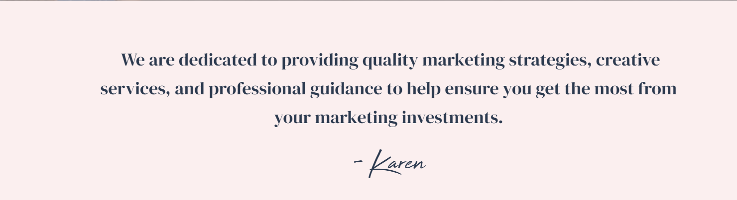
5. The Value Proposition Section
When we design and build websites for service-based businesses, we usually recommend a section early on the homepage that captures your mission statement or your unique value proposition. This way, as visitors scroll, they learn more about why they should choose your business.
Keep the design and copy simple here. This makes it easy for visitors to absorb the messaging. For KJS, we’ve kept the design modern and feminine to appeal to KJS’s ideal clientele.
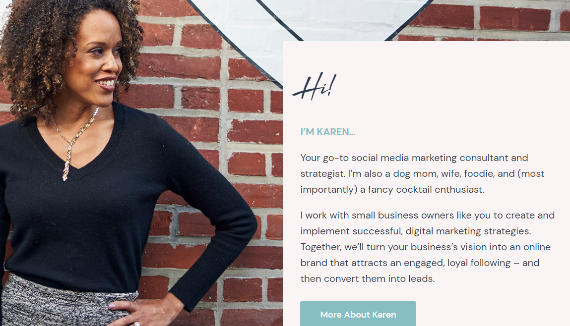
6. The About Us Section
You don’t need to leave all the personal details about your brand on your About page! This is especially true if you’re a small business or if you’re the face of your brand. We recommend having a “mini” About Us section on your homepage to spark a connection early on in the user journey. Provide just enough detail along with an engaging photo so visitors can “meet” you.
Since KJS is a boutique agency and Karen acts as the primary face of the brand, we’ve featured her photo prominently on the homepage. Our goal was to make it feel like you’re pulling up a chair to have a chat with her over a cup of coffee.
The copy also adds a touch of personality that feels warm and inviting, while appealing to her client’s desires so they know they’re in the right place.

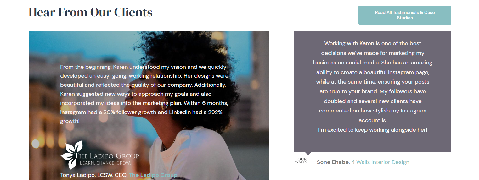
7. Social Proof Sections
Social proof is when you use things like testimonials, stamps of approval, and logos to show that your business has done good work for others. Since your homepage is often one of the first impressions prospects will get of you, it’s particularly important to inspire trust here with social proof.
For KJS, we implemented two primary social proof bars to highlight her authority and the great results she’s gotten for clients. We spaced them out in the design so visitors can absorb them gradually. In other words, we’re not throwing it all at them at once. It feels natural.
- We created a logo bar that showcases some of the big clients KJS has worked with. This strategy can go a long way, especially if you’ve worked with names your ideal clients may recognize.
- We added a visually interesting testimonials section. These testimonials don’t just prove that her business is legit. They also highlight the struggles her past clients had and how exactly working with KJS benefitted them. This shows prospects what’s possible for them too.
If your business has been featured by media outlets or won awards, you can also showcase those on your homepage.
That said, don’t feel like you have to cram it all onto one page. Social proof should be peppered throughout your whole website. The goal is to provide enough social proof to look impressive and reputable without being overwhelming. As always, keep the design clean with plenty of white space.
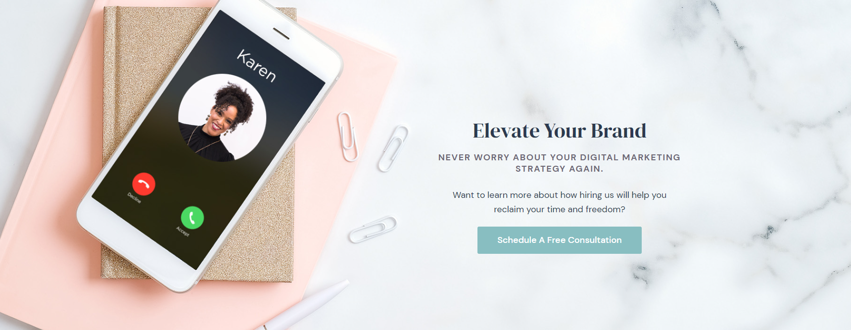
8. The Get Started Section
For service-based businesses, we recommend having a strong, clear section on your homepage that encourages visitors to take the next “big step.” By “big step,” we mean contacting you, filling out an enquiry/application form, or booking a call directly.
For KJS’s homepage, we wanted to create a section that prompts visitors to schedule a consultation. Once they reach this point on the page, they know what the agency does, who Karen is, and that KJS has worked with some big-name clients.
We crafted a visually captivating section dedicated to this. The copy is minimal and benefit-driven, and there’s a strong call to action that draws the eye.
We paired the call to action with a fun image that plays along with KJS’s brand personality. The image of an incoming phone call from Karen herself feels personal and friendly, while the feminine office supplies appeal to her ideal clientele.
Keep in mind that not all visitors will be ready to reach out quite yet, which brings us to the next essential section for your homepage.
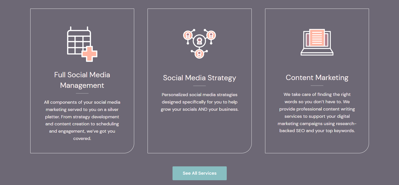
9. The Services Section
Many website visitors will want to quickly see the specific services you offer before they reach out. If you have more than one primary service you’re actively selling, we highly recommend having a services section on your homepage. Depending on your business and your website strategy, this section might come early on your homepage or closer to the bottom.
The services section allows prospects to scope out your offerings before they take action. You can then either lead prospects to a navigational service page that provides more context or direct them straight to individual service pages.
Design tips to improve your services section:
- Add visuals or icons to emphasize each service in your list.
- Be strategic about whether you present your services horizontally or vertically; if the body copy is more than a couple of sentences, vertical is usually better.
- Add a clear header, followed by concise body copy that describes the service.
- As always, incorporate plenty of white space and don’t try to cram in ALL the details at this point in the website journey.
Is it time to redesign your service-based business’s website?
First up, if you’re not sure if now’s a good time, check out our blog How often should you redesign your website?
If it’s time, we can help. At Drio, we design creative, strategy-driven websites that solve problems and make your brand the obvious choice. If you’re looking for a website that matches your business’s growth and does more than look pretty (though it’ll certainly do that too), we can help you get there.
Learn more about our website design services.

Share This Post
About the Author: Rachel McFadden